Software component diagram examples: a practical guide

A software component diagram is a UML structural diagram that maps the modular units of a system, their provided and required interfaces, and the dependencies between them. These diagrams sit at the heart of software architecture communication, giving developers, project managers, and technical students a shared visual language for understanding how a system fits together. The best software component diagram examples do more than show boxes and arrows. They reveal which components can be swapped, scaled, or replaced without breaking the whole system.
What makes a great software component diagram example?
Component diagrams model the structural, modular organisation of a software system. Each component represents an independent, deployable unit such as a library, microservice, or executable. The diagram shows how these units connect through well-defined interfaces, not through internal implementation details.
SponsoredCheck out today's featured offer →The UML standard defines two key interface notations. A "lollipop" symbol marks a provided interface, meaning the component exposes that capability to others. A "socket" symbol marks a required interface, meaning the component depends on another to supply that capability. These two notations create a contract language that any team member can read at a glance.

The real value of a component diagram is not the picture itself. Shared understanding comes from forcing explicit interface definitions early in development, which reduces system fragility before a single line of code is written.
Key elements and notation in UML component diagrams
Understanding the building blocks of UML component diagram examples makes every diagram you read or create far more useful.
Core elements to know:
- Component. A modular, replaceable unit drawn as a rectangle with the «component» stereotype or a small component icon. Examples include a PaymentService, AuthModule, or ReportingEngine.
- Provided interface (lollipop). A small circle on a line extending from the component. It signals what the component offers to the outside world.
- Required interface (socket). A half-circle on a line. It signals what the component needs from another component to function.
- Dependency arrow. A dashed arrow showing that one component depends on another, typically drawn from the requiring component toward the providing one.
- Stereotype labels. Tags such as «microservice», «library», «executable», or «database» clarify the physical nature of each component.
- Package or deployment boundary. A folder-shaped container grouping related components, such as all services within a single Docker container or cloud region.
Grouping components into packages or deployment boundaries enhances readability and clarifies physical versus logical structures. A diagram that groups three microservices inside a "Payment Cluster" boundary immediately tells a reader how those services are deployed together.
Components must stay "black-boxed," focusing on public contracts and dependencies rather than internal logic. Showing internal class details is the most common mistake newcomers make, and it turns a clean diagram into an unreadable mess.
Pro Tip: Add stereotype labels to every component from the start. A rectangle labelled «database» versus «microservice» saves hours of confusion during architecture reviews.
1. E-commerce platform: mapping service dependencies
An e-commerce platform is one of the clearest software component diagram examples for showing real-world API dependencies. The diagram typically shows four core components: CatalogService, CartService, OrderService, and PaymentService.
CatalogService provides a product data interface. CartService requires that interface and provides a cart management interface to OrderService. OrderService requires the cart interface and provides an order submission interface to PaymentService. Each arrow in the diagram represents a real API call, making the dependency chain visible to every stakeholder.
Component diagrams in e-commerce clarify these dependencies, enabling independent scaling and reducing integration complexity. When a team can see that CartService only talks to CatalogService through one defined interface, they can scale or replace CartService without touching the rest of the system.
2. Microservices architecture with an API gateway
A microservices component diagram adds an API Gateway component at the top. The gateway provides a single entry interface to external clients and routes requests to backend services: UserService, ProductService, and NotificationService.
Each backend service sits inside its own deployment boundary. Asynchronous messaging between services, such as an event queue between OrderService and NotificationService, appears as a dependency arrow labelled with the queue name. This makes the asynchronous flow visible, which is often invisible in code.
Text-to-diagram tools like PlantUML support cloud grouping and asynchronous messaging visualisation natively. That means you can generate this entire diagram from a short text file and commit it to your version control system alongside your code.
3. Legacy monolith refactoring with the Strangler Fig Pattern
The Strangler Fig Pattern is a legacy migration strategy where new microservices gradually replace parts of a monolith. A component diagram for this scenario shows the original monolith as a single large component, with new wrapper components sitting alongside it.
Each wrapper component provides the same interface as the monolith section it replaces. Dependency arrows shift from pointing at the monolith to pointing at the new service as migration progresses. The diagram becomes a visual audit trail showing exactly how far the refactoring has gone.
Component diagrams in legacy refactoring provide visual audit trails for incremental microservice extraction. This clarity convinces stakeholders that the migration is on track and limits the risk of uncontrolled change. For more patterns like this, the backend architecture examples on Blueprintbot show how real systems handle this transition.
4. Cloud data pipeline architecture
A cloud data pipeline diagram shows how data moves from ingestion to storage to analysis. Typical components include an IngestionService, a MessageQueue (such as a Kafka topic), a TransformationService, a DataWarehouse, and an AnalyticsEngine.
The IngestionService provides a data intake interface to the MessageQueue. The TransformationService requires the queue interface and provides a cleaned data interface to the DataWarehouse. The AnalyticsEngine requires the warehouse interface and provides query results to a reporting dashboard component.
This example is particularly useful for project managers because it maps every handoff point. Any bottleneck in the pipeline appears as a component with many incoming dependency arrows, making performance risks visible before they become production incidents.
5. Mobile app with modular backend interfaces
A mobile app component diagram places the mobile client at the top. Below it sit three backend components: AuthService, TransactionService, and NotificationService. The mobile client requires interfaces from all three, shown as three separate socket symbols.
Each backend service provides its interface independently. This means the team can update the NotificationService without touching AuthService or TransactionService. The diagram makes the modularity of the backend explicit, which is especially useful when onboarding new developers who need to understand the system quickly.
For teams managing API boundary definitions across these services, a well-drawn component diagram reduces the time spent explaining integration points in meetings.
6. Recommended tools for creating component diagrams
The choice of tool shapes how well your diagrams age alongside your codebase.
| Approach | Best for | Key advantage |
|---|---|---|
| Text-to-diagram (e.g., PlantUML) | Agile teams, version-controlled repos | Diagrams live in code; diffs are readable |
| Visual drag-and-drop tools | Stakeholder presentations, one-off diagrams | Faster for non-technical audiences |
| Integrated modelling platforms | Enterprise architecture, large teams | Full UML support, traceability features |
PlantUML reduces diagram maintenance time by over 50% compared to manual drawing tools. That saving compounds over a project's lifetime, especially when architecture changes frequently in agile sprints.
The free software planning tools available through Blueprintbot support diagram creation and planning without requiring a steep learning curve. For teams already using project management software to coordinate sprints, integrating diagram reviews into existing workflows keeps architecture documentation current.
Pro Tip: Store PlantUML diagram files in the same repository as your source code. When a developer changes a service interface, the diagram update becomes part of the same pull request, making architectural drift nearly impossible to miss.
7. Best practices for using component diagrams in architecture design
The most effective component diagrams follow a small set of disciplined practices that separate useful documentation from visual noise.
Focus on public interfaces, not internals. Effective component diagrams focus strictly on public interfaces rather than internal class details, which fosters loose coupling and easier upgrades. A diagram that shows a PaymentService's internal database schema is not a component diagram. It is a class diagram in disguise, and it confuses both audiences.
Define API contracts early. Early interface definition prevents tight coupling and system fragility. When two teams agree on an interface before writing code, they can build in parallel without stepping on each other. The component diagram is the contract document that makes that agreement visible and permanent.
Update diagrams to prevent architectural drift. Architectural drift occurs when physical deployment no longer matches logical design, producing "spaghetti architecture" as systems grow. Mapping components to deployable units such as JARs, Docker containers, or microservices keeps the diagram honest. Schedule a diagram review at the end of every sprint to catch drift before it compounds.
Group by function or deployment boundary. Components grouped by domain (e.g., "Payment Cluster," "User Management") or by deployment unit are far easier to scan than a flat list of boxes. This grouping also reveals which components are candidates for extraction into separate services.
A component diagram that no one updates is worse than no diagram at all. It creates false confidence and sends new developers down the wrong path. The discipline of keeping diagrams current is what separates teams that scale from teams that struggle.
For open-source examples of how real teams apply these practices, the architecture case studies on Blueprintbot show concrete before-and-after diagrams from production systems.
Key takeaways
The most effective component diagrams focus on public interfaces and deployment boundaries, not internal logic, which is what keeps systems modular and teams aligned.
| Point | Details |
|---|---|
| Use lollipop and socket notation | These two symbols define the contracts between components and are the foundation of every UML component diagram. |
| Keep components black-boxed | Show only public interfaces and dependencies; internal logic belongs in class or sequence diagrams. |
| Update diagrams every sprint | Outdated diagrams cause architectural drift; tie diagram reviews to your existing sprint cadence. |
| Use text-to-diagram tools | PlantUML and similar tools cut maintenance time and keep diagrams version-controlled alongside code. |
| Apply the Strangler Fig Pattern visually | Component diagrams make legacy refactoring progress visible to both technical teams and non-technical stakeholders. |
Why I think most teams are using component diagrams wrong
Most teams treat component diagrams as a one-time deliverable. They draw the diagram at the start of a project, put it in a wiki, and never touch it again. Six months later, the diagram describes a system that no longer exists. New developers read it, build mental models from it, and then spend weeks unlearning those models when they hit the real codebase.
The teams I have seen get genuine value from component diagrams treat them as living documents. They store them as PlantUML files in the repository. They review them in sprint retrospectives. They use them to onboard new developers in under an hour, because the diagram shows the whole system at a glance.
The other mistake I see constantly is trying to show too much. A component diagram with 40 components and 80 arrows is not a diagram. It is a wall of confusion. The best diagrams I have worked with show 6–12 components and tell one clear story: here is how data flows through this system, and here are the boundaries you must not cross.
If you are a project manager, a well-maintained component diagram is the single most effective tool for running architecture reviews. It gives every person in the room a shared reference point, which cuts meeting time and reduces misunderstandings. Start simple, keep it current, and your team will thank you for it.
— Rishi
How Blueprintbot helps you build better software blueprints
Blueprintbot generates complete software blueprints from a plain-language description of your app idea. Those blueprints include system architecture outputs that map directly to component diagram structures, giving developers and project managers a concrete starting point rather than a blank canvas.
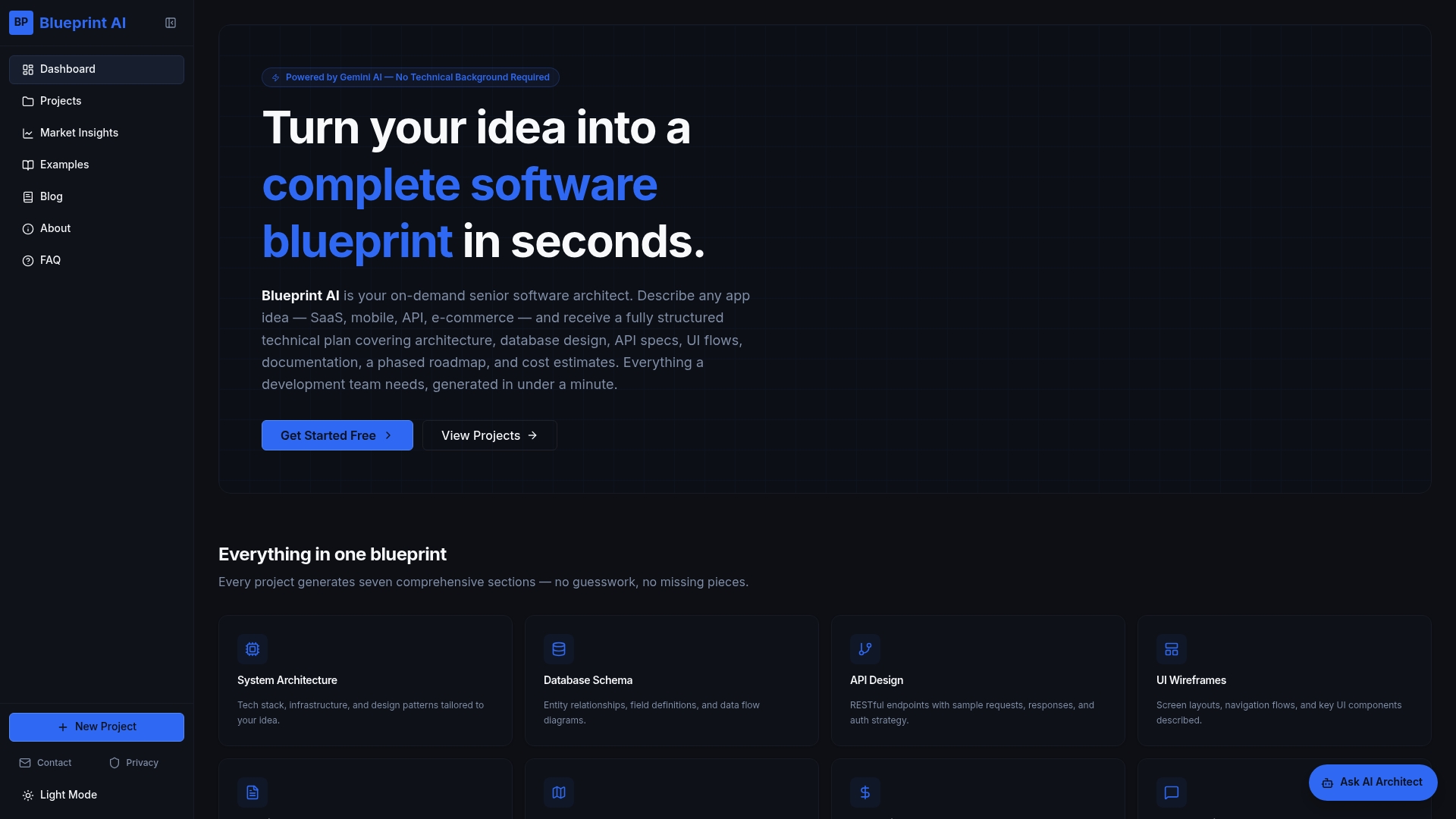
The example software blueprints on Blueprintbot show worked examples across domains including e-commerce, mobile apps, and data pipelines. Each blueprint includes architecture diagrams, API designs, and database schemas. Teams can study these examples to understand how component relationships translate into real technical specifications, then adapt them to their own projects without starting from scratch.
FAQ
What is a software component diagram?
A software component diagram is a UML structural diagram that shows the modular units of a system, their provided and required interfaces, and the dependencies between them. It focuses on physical deployment units such as libraries, microservices, or executables rather than internal class details.
What is the difference between a component diagram and a class diagram?
A component diagram shows deployable units and their interfaces at the system level. A class diagram shows internal attributes and methods within a single component. Use component diagrams for architecture communication and class diagrams for detailed design within a module.
How do I create a component diagram for a microservices system?
Start by listing every service, then define the interface each service provides and requires. Draw each service as a component with lollipop and socket notations, group services by deployment boundary, and add dependency arrows to show which services call which. Tools like PlantUML let you generate this diagram from a text file.
What is the Strangler Fig Pattern in component diagrams?
The Strangler Fig Pattern is a legacy migration strategy where new microservices gradually replace parts of a monolith. A component diagram tracks this by showing the monolith alongside new wrapper components, with dependency arrows shifting from the monolith to the new services as migration progresses.
How often should component diagrams be updated?
Component diagrams should be updated at the end of every sprint or whenever a service interface changes. Architectural drift between the diagram and the actual deployment causes confusion and technical debt that compounds quickly in growing systems.